One of the main reasons analysts, developers, and data scientists use R is its strong support for high-quality visualizations. A confusion matrix presents the results of a classification model in a simple table. It helps you understand how your machine learning model performed in a clear and structured way.
In this guide, you will learn how confusion matrices work and how to create and interpret them in R.
What Is Confusion Matrix?
In machine learning, you train a model to make predictions based on the data it was trained on. Each prediction corresponds to a specific class, which represents one of the possible labels the system has learned to recognize.
A confusion matrix is a table that shows how well a classification model performs. It compares the model's predicted class with the actual class for each data point and visually separates the results into correct predictions and different types of errors.
Note: Confusion matrices are used in supervised machine learning, where models are trained using labeled data. If you are new to these concepts, learn more about the difference between supervised and unsupervised learning.
By looking at the confusion matrix, you can see where the model performed correctly and where it made mistakes. You can use this information to improve the model in the next round of training.
Confusion Matrix Components
A confusion matrix breaks down a model's predictions into four possible outcomes:
| Outcome | Description |
|---|---|
| True Positive (TP) | The model correctly predicts the target class. |
| True Negative (TN) | The model correctly predicts that the target class is not present. |
| False Positive (FP) | The model incorrectly predicts the target class when it is not present. |
| False Negative (FN) | The model fails to predict the target class when it is present. |
Most classification evaluation metrics, like accuracy, precision, recall, and specificity, are calculated from these four values.
Binary Classification Model
A binary classification model has only two classes:
- Positive class. This is the target class the model is trying to detect.
- Negative class. This includes all other outcomes.
The most common way to show predicted and actual values in a confusion matrix is with a 2x2 table that has four cells. Rows represent the actual class, while columns represent the predicted class.
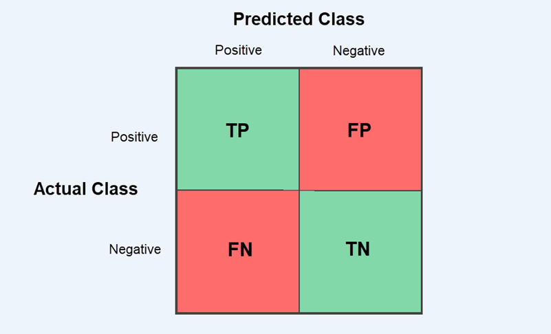
True Positive (TP) and True Negative (TN) predictions appear in the diagonal cells and show how often the model is correct.
False Positive (FP) and False Negative (FN) errors appear in the off-diagonal cells and represent the types of mistakes the model makes. This matters because different problems prioritize different types of errors. For example, a machine learning model for payment processing might block a legitimate transaction (false positive) or let a fraudulent payment go through (false negative).
Multi-Class Classification Model
In multi-class classification, the model predicts more than two classes. The confusion matrix extends beyond a 2x2 table to an NxN table, where N represents the number of classes.
For example, the 3x3 confusion matrix below compares three classes: A, B, and C. The rows show the actual classes, while the columns represent classes predicted by the model.
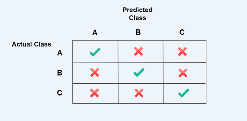
The checkmarks along the diagonal are correct predictions. Off-diagonal entries marked with crosses are misclassifications, meaning the model predicted one class, but the actual class was different.
Note: Correct predictions are always on the diagonal, and mistakes are outside it. This pattern is true for all confusion matrices, whether they are binary or multi-class.
When evaluating a multi-class confusion matrix, you need to examine each class one at a time. Treat the class you are analyzing as positive and group all the remaining classes as negative.
For example, when analyzing class A:
- If both the predicted and actual classes are A, it is a True Positive (TP).
- If the model predicts A, but the actual class is B or C, it is a False Positive (FP).
- If the actual class is A, but the model predicts B or C, it is a False Negative (FN).
- All other cells are True Negatives (TN).
You then repeat the same process for classes B and C. This way, the confusion matrix is evaluated as a series of binary problems, one class at a time.
In machine learning (ML) documentation, this method is often called the one-vs-all approach.
How to Create a Confusion Matrix in R
There are several ways to create and visualize a confusion matrix in R. Most people use one of the following methods:
table()function. A simple built-in R function that creates a basic confusion matrix.caretpackage. A machine learning toolkit that can generate confusion matrices and automatically calculate evaluation metrics.yardstickpackage. This package is part of the tidymodels ecosystem. It returns confusion matrices and results in a tidy data format, which makes them easier to work with.
The examples in this guide are presented using the R console on Ubuntu 24.04. If you are using RStudio or another R environment, the same commands apply.
Create Confusion Matrix Using table() Function
The table() function is built into R and counts how often combinations of values occur. You can use table() to create a confusion matrix by comparing model predictions with actual outcomes. Refer to the steps below:
Step 1: Load the Data
This example simulates a machine learning model used in payment processing. The model predicts whether a transaction is approved, declined, or requires review.
We will use two vectors:
actualcontains the real transaction outcomes.predictedcontains the outcomes predicted by the model.
In real machine learning projects, these values are usually retrieved from a dataset or CSV file containing the model's predictions.
For the purposes of this tutorial, you can define the values manually by copying these vectors into your R console:
actual <- c(
"Approved","Approved","Declined","InsFunds","ExpiredCard",
"Approved","Review","Declined","Approved","ExpiredCard",
"InsFunds","Approved","Review","Declined","Approved",
"ExpiredCard","Approved","InsFunds","Declined","Approved"
)

predicted <- c(
"Approved","Approved","Declined","InsFunds","ExpiredCard",
"Review","Review","Declined","Approved","ExpiredCard",
"InsFunds","Approved","Approved","Declined","Approved",
"ExpiredCard","Approved","Declined","Declined","Approved"
)
Make sure that both vectors contain the same number of elements.
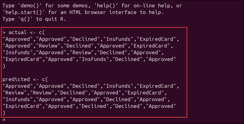
Each prediction should correspond to one real transaction outcome.
Step 2: Create Confusion Matrix
Use the following command to compare the model's predictions with the actual results:
conf_matrix <- table(Actual = actual, Predicted = predicted)To display the confusion matrix, enter:
conf_matrixBased on the payment data, the confusion matrix shows how well the model has performed:
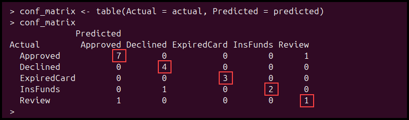
The values on the diagonal are correct predictions, while the values outside the diagonal are misclassifications. The model correctly predicted 17 transactions, while 3 predictions were incorrect.
Step 3: Calculate Evaluation Metrics
The confusion matrix does more than just show correct or incorrect predictions. You can also use it to calculate evaluation metrics from the results.
The most common metrics include:
- Accuracy. How often the model makes correct predictions.
- Precision. How often a predicted class is correct.
- Recall. How often the model correctly identifies a class when it is present.
- Specificity. How often the model correctly identifies that a class is not present.
To calculate accuracy from the same payment dataset, enter:
accuracy <- sum(diag(conf_matrix)) / sum(conf_matrix)The diag() function extracts the diagonal values from the matrix, as they represent the correct predictions. To display the result, enter:
accuracy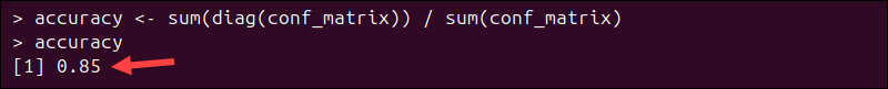
The confusion matrix contains 20 transactions in total, and 17 were classified correctly. This gives the model an accuracy of 0.85 (85%) for this sample.
In a multi-class model, precision, recall, and specificity need to be calculated one class at a time. Because they are more difficult to calculate manually, most R workflows use caret or yardstick to compute them automatically.
Step 4: Visualize Confusion Matrix
The table() function prints the confusion matrix as text, but you can visualize it using the ggplot2 package.
To install ggplot2, enter:
install.packages("ggplot2")Load the package:
library(ggplot2)Because ggplot2 works with tabular data, convert the confusion matrix into a data frame:
conf_df <- as.data.frame(conf_matrix)Run the following command to create a heatmap:
# Create a heatmap
  ggplot(conf_df, aes(x = Predicted, y = Actual, fill = Freq)) +

  # Draw one tile for each cell
  geom_tile(color = "white") +

  # Print the count value inside each tile
  geom_text(aes(label = Freq)) +

  # Reverse the y-axis so the top row matches the printed confusion matrix
  scale_y_discrete(limits = rev(unique(conf_df$Actual))) +

  # Add a chart title and axis labels
  labs(
    title = "Confusion Matrix for Payment Transaction Classification",
    x = "Predicted Outcome",
    y = "Actual Transaction Outcome"
)Note: Comments are marked with the # symbol. R ignores everything after this symbol, so comments do not affect how the code runs.
Each tile represents one cell in the confusion matrix, while the number shows the count for that cell.
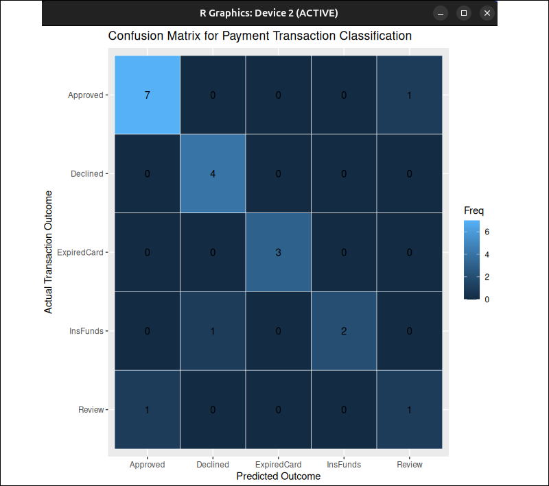
Cells with a stronger color intensity indicate a higher count
Create Confusion Matrix Using caret Package
With the caret package, you can create a confusion matrix and get evaluation metrics in one phase. Use the steps below:
Step 1: Install and Load caret
Use the following command to install the caret package:
install.packages("caret")Load the package in R:
library(caret)Step 2: Load the Data
You can use the same payment-processing data from the table() example. If you have already defined the vectors in the previous section, skip this step.
actual <- c(
"Approved","Approved","Declined","InsFunds","ExpiredCard",
"Approved","Review","Declined","Approved","ExpiredCard",
"InsFunds","Approved","Review","Declined","Approved",
"ExpiredCard","Approved","InsFunds","Declined","Approved"
)

predicted <- c(
"Approved","Approved","Declined","InsFunds","ExpiredCard",
"Review","Review","Declined","Approved","ExpiredCard",
"InsFunds","Approved","Approved","Declined","Approved",
"ExpiredCard","Approved","Declined","Declined","Approved"
)
Step 3: Convert Data to Factors
The confusionMatrix() function in caret automatically computes performance metrics. It works best when the predicted and actual values are stored as factors with the same class level.
Use the following command to convert the actual values into factors:
actual_factor <- factor(actual)Next, convert the predicted values to factors as well:
predicted_factor <- factor(predicted, levels = levels(actual_factor))This ensures that the predicted values use the same class labels and order as the actual values, so there are no mismatches.
Step 4: Create the Confusion Matrix
Enter the following command to create a confusion matrix using caret:
caret_matrix <- confusionMatrix(data = predicted_factor, reference = actual_factor)To display the results, enter:
caret_matrixIn the confusionMatrix() output, data represents the predicted values, while reference represents the actual values.
In addition to the confusion matrix, caret automatically calculates and displays both the overall statistics and performance metrics for each class:
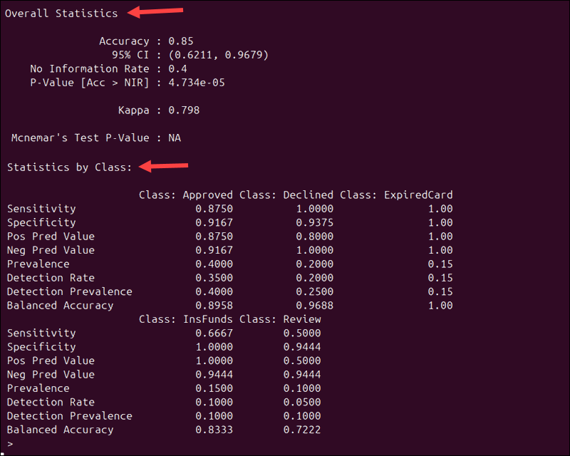
Because the same payment data is used, the overall statistics match the results from the example created with the table() function:
- Accuracy. The model's overall accuracy remains 0.85 (85%).
- Kappa. This value measures how much better your model performs compared to random chance.
The output also shows how well the model performs for each individual class. For example, Sensitivity tells you how often the model correctly identifies a class when it is present:
- Approved transactions have a sensitivity of 0.875, meaning that 87.5% of approved payments were correctly identified.
- Declined and ExpiredCard transactions have a sensitivity of 1.00. This means that all transactions in those categories were classified correctly.
- Review transactions have a sensitivity of 0.50. This indicates that the model had trouble identifying transactions that need manual review.
The caret package evaluates each class separately, treating that class as the positive class and grouping all other classes as negative. This follows the previously mentioned one-vs-all approach.
Step 5: Visualize Confusion Matrix
You can visualize the confusion matrix using the ggplot2 package. If you have not installed it yet, enter the following command:
install.packages("ggplot2")Then, load it with:
library(ggplot2)Since ggplot2 works with tabular data frames, you need to convert the confusion matrix into a data frame before creating a chart:
conf_df <- as.data.frame(caret_matrix$table)Run the following command to create a heatmap:
# Create a heatmap from the caret confusion matrix
ggplot(conf_df, aes(x = Prediction, y = Reference, fill = Freq)) +

  # Draw one tile for each cell
  geom_tile(color = "white") +

  # Print the count value inside each tile
  geom_text(aes(label = Freq)) +

  # Reverse the y-axis so the top row matches the printed confusion matrix
  scale_y_discrete(limits = rev(unique(conf_df$Reference))) +

  # Add a chart title and axis labels
  labs(
    title = "Confusion Matrix for Payment Transaction Classification",
    x = "Predicted Outcome",
    y = "Actual Transaction Outcome"
  )
ggplot2 displays the confusion matrix as a grid of tiles. Each tile represents one cell in the matrix, and the number inside the tile shows how many times that combination occurred. Tiles with higher color intensity represent higher observation counts.
Create Confusion Matrix Using yardstick
In the previous examples, the confusion matrix was a small 5x5 table, and the printed summary was quite long. With larger datasets, the matrix can quickly become cluttered and hard to read.
The yardstick package is part of the tidymodels ecosystem. It returns results as data frames, called tibbles, which are easier to inspect, filter, and visualize. Use the instructions in the sections below:
Step 1: Install yardstick
Use the following command to install the yardstick package:
install.packages("yardstick")Load the package into R:
library(yardstick)Step 2: Load the Data (Optional)
This example uses the same payment-processing data as the table() and caret examples. If you have already defined these vectors, you can skip this step.
actual <- c(
"Approved","Approved","Declined","InsFunds","ExpiredCard",
"Approved","Review","Declined","Approved","ExpiredCard",
"InsFunds","Approved","Review","Declined","Approved",
"ExpiredCard","Approved","InsFunds","Declined","Approved"
)

predicted <- c(
"Approved","Approved","Declined","InsFunds","ExpiredCard",
"Review","Review","Declined","Approved","ExpiredCard",
"InsFunds","Approved","Approved","Declined","Approved",
"ExpiredCard","Approved","Declined","Declined","Approved"
)
Step 3: Create a Data Frame
In tidy data, variables are stored in columns and observations in rows. To prepare the dataset for yardstick, place the vectors into a data frame:
payment_results <- data.frame(
  Actual = actual,
  Predicted = predicted
)
Step 4: Convert Data to Factors
To ensure both columns use the same class labels and order, convert them to factors:
payment_results$Actual <- factor(payment_results$Actual)
payment_results$Predicted <- factor(
  payment_results$Predicted,
  levels = levels(payment_results$Actual)
)
This step helps avoid mismatches during the calculation process.
Step 5: Create the Confusion Matrix
Run the following command to create a confusion matrix:
yardstick_matrix <- conf_mat(payment_results, truth = Actual, estimate = Predicted)The conf_mat function compares the actual and predicted values and counts how many times each combination occurs. It uses two main arguments:
truthtellsyardstickwhich column contains the actual values.estimatetellsyardstickwhich column contains the predicted values.
The truth/estimate structure is consistently used across other yardstick confusion-matrix tools.
To display the result, enter:
yardstick_matrix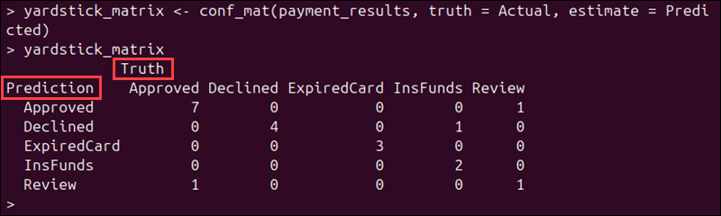
Since we used the same dataset, the confusion matrix has the same counts as in the table() and caret examples.
Step 6: Review Evaluation Metrics
Like caret, yardstick can automatically calculate evaluation metrics. Use these commands to calculate common metrics:
accuracy(payment_results, truth = Actual, estimate = Predicted)
precision(payment_results, truth = Actual, estimate = Predicted)
recall(payment_results, truth = Actual, estimate = Predicted)
spec(payment_results, truth = Actual, estimate = Predicted)
Instead of printing a long summary, these functions return tidy results as tibbles. They are easier to inspect and visualize using other tidyverse tools.
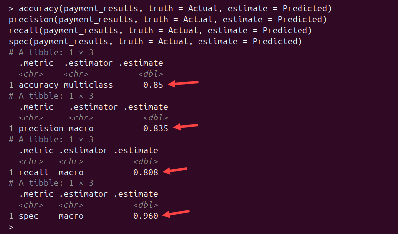
Unlike caret, which reports metrics for each class separately, yardstick returns multiclass averages by default. For example:
- Accuracy = 0.85. The model correctly classified 85% of the transactions.
- Precision (macro) = 0.835. On average, when the model predicts a class, it is correct 83.5% of the time.
- Recall (macro) = 0.808. On average, the model correctly identifies 80.8% of the actual class instances.
- Specificity (macro) = 0.960. The model correctly identifies negative cases for each class 96% of the time.
The macro estimator means that yardstick calculates the metric for each class individually and then averages the results across all classes.
Step 7: Visualize Confusion Matrix
You can show the confusion matrix visually using the autoplot() function. This function is part of the ggplot2 package.
If ggplot2 is not installed, install it first:
install.packages("ggplot2")Load the package:
library(ggplot2)autoplot() generates a visualization from the confusion matrix object for you. You do not need to write ggplot2 plotting code manually, as in the previous examples.
Note: Find out which popular machine learning libraries enable you to build models without writing large amounts of code from scratch.
yardstick supports heatmap visualizations and mosaic plots for confusion matrices. To create a heatmap, run:
autoplot(yardstick_matrix, type = "heatmap")The heatmap displays predicted values on the x-axis and truth values on the y-axis, matching the layout of the printed confusion matrix.
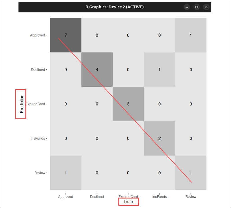
In this example, the darker tiles represent higher counts of observations.
Use the following command to create a mosaic plot:
autoplot(yardstick_matrix, type = "mosaic")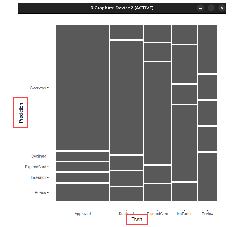
A larger rectangle indicates that more transactions fall into that group. It's easy to see which predictions occur more frequently and compare their relative proportions, especially when working with large datasets.
Evaluation Metrics Overview
Use the following table as a guide when interpreting confusion matrix results:
| Metric | Description | Formula |
|---|---|---|
| Sensitivity (Recall, True Positive Rate) | The proportion of actual positive cases that the model identified correctly. | TP / (TP + FN) |
| Specificity (True Negative Rate) | The proportion of actual negative cases that the model identified correctly. | TN / (TN + FP) |
| Precision (Positive Predictive Value - PPV) | The proportion of predicted positive cases that are actually positive. | TP / (TP + FP) |
| Negative Predictive Value (NPV) | The proportion of predicted negative cases that are actually negative. | TN / (TN + FN) |
| Accuracy | The overall proportion of correct predictions. | (TP + TN) / Total |
| Balanced Accuracy | The average of sensitivity and specificity. Useful when classes are not distributed evenly. | (Sensitivity + Specificity) / 2 |
| Kappa | Measures how much better the model performs compared to random guessing. | - |
| No Information Rate (NIR) | The baseline accuracy, calculated by always predicting the most frequent class. | - |
| Detection Rate | The number of true positives divided by the number of total observations. | TP / Total |
| Detection Prevalence | The overall proportion of cases predicted as positive. | (TP + FP) / Total |
| P-Value (Accuracy vs NIR) | A statistical test that determines if accuracy is significantly better than baseline accuracy (NIR). | - |
| McNemar’s Test P-Value | Compares the number of false positives and false negatives. For example, a p-value less than 0.05 indicates an imbalance between FP and FN. | - |
Conclusion
This tutorial helped you learn how to build and interpret confusion matrices in R. This lets you determine where your classification model performs well and where it needs improvement, making it easier to refine your machine learning models.
If you need a place to run your machine learning environment, check out our Bare Metal Cloud GPU instances.