Terraform's CLI output is text-based. As configurations grow and include more resources, reading dependencies in HCL becomes difficult. Visualization turns Terraform configurations, plans, and states into diagrams instead of textual outputs. There are several tools that help create Terraform visualizations.
This article covers eight Terraform visualization tools and reviews them in-depth to help you make an informed choice.
What Is Terraform Visualization and Why Do You Need It?
Terraform visualization converts Infrastructure as Code configurations into diagrams that show resources and their relationships. The resulting graphs make complex Terraform environments easier to inspect and review.
Visualizations are essential for a few reasons:
- Code review. A diagram makes it obvious when a pull request (PR) affects more elements than the description suggests.
- Onboarding. Reading through dozens of .tf files is difficult. New team members orient faster by looking at diagrams instead.
- Documentation. Generated diagrams are accurate because they stem from source, unlike hand-drawn architecture diagrams that drift out of date.
- Change risk. Some tools flag which resources a change affects before running terraform apply.
Note: Not every tool visualizes the same thing. Some render the current state, others render a plan, and a few render live infrastructure. Check a tool's input/output before adopting it in your workflow.
8 Best Terraform Visualization Tools
Terraform visualization tools range from free CLI utilities to hosted platforms with visual design canvases. Some tools generate local dependency graphs, while others are cloud-based with interactive dashboards, change analysis, CI integration, or infrastructure design options.
The sections below analyze eight tools in greater depth.
Pluralith
Pluralith is a CLI and hosted platform that generates infrastructure diagrams from a Terraform plan. Its CLI runs terraform plan under the hood and generates diagrams locally as part of a CI workflow.
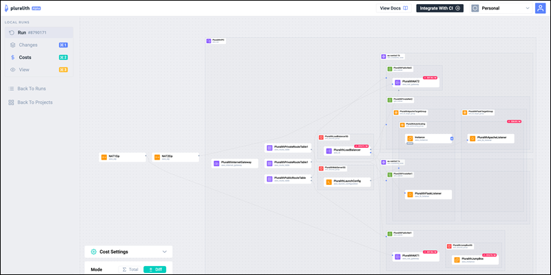
The hosted dashboard adds Terraform plan history, PR comments, change highlighting, drift detection, and cost information through Infracost.
Pluralith Key Features
Pluralith's main features include:
- Change highlighting. Shows planned changes in infrastructure diagrams. Pinpoints exactly which resources a plan adds, changes, or destroys.
- Drift detection. Compares actual infrastructure against configuration and visualizes any drift.
- PR diagrams. Adds infrastructure diagrams to PRs, simplifying peer code review.
- CI automation. Runs inside a CI pipeline to maintain current documentation on every merge.
- Cost information. Integrates Infracost data into infrastructure diagrams.
Pluralith Pros
Pluralith's pros are:
- Minimal setup. Pluralith uses one CLI command to produce a diagram. There is no separate rendering step.
- Faster reviews. Change highlighting simplifies PR reviews. The process is faster than reading raw plan output.
- Transparent cost data. The cost data appears in the same diagram instead of a separate report, which simplifies decision-making.
Pluralith Cons
Its main cons are:
- Online tool. Pluralith is not fully offline. It requires a Pluralith account and API key to function.
- Incomplete cost visualization. Cost visualization depends on Infracost's provider coverage. It does not cover every resource type by default.
Pluralith Pricing
Pluralith offers two pricing models. The free tier supports local development and personal projects. Paid plans include CI automation, team collaboration, and hosted diagrams.
Pricing is usage-based, with flat-rate packages tied to monthly terraform plan runs.
Blast Radius
Blast Radius is an open-source tool that creates interactive Terraform dependency graphs. It uses d3.js to show Terraform resources and their relationships in a browser.
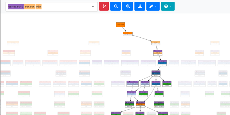
The tool makes complex Terraform configurations easier to navigate by letting users to pan, zoom, and explore resource dependencies. It can visualize nested Terraform modules rather than limiting the view to a flat list.
Blast Radius Key Features
The key features are:
- Interactive graphs. Users can pan, zoom, and explore resources through an interactive image.
- Local web server. The tool runs a local web server to show Terraform visualizations in a web browser.
- Module support. Blast Radius supports nested module stacks.
- Docker support. The tool runs in Docker, avoiding local Python dependencies.
Blast Radius Pros
Some pros are:
- Free and open source. Blast Radius does not require an account or an API key.
- Interactive. Large graphs are easy to inspect through its interactive features.
- Educational. Blast Radius helps users understand Terraform dependencies and how Terraform resources connect.
Blast Radius Cons
Its cons are:
- Outdated. The original project is not actively maintained in recent years. There may be compatibility issues with newer Terraform configurations.
- Dependencies. Blast Radius requires additional dependencies, such as Graphviz and PyHCL.
- Community maintained. Community forks improve compatibility, but they are not official replacements for the original project and may have security issues.
Blast Radius Pricing
Blast Radius is a free, open-source project. The original tool has no hosted or paid version.
Terraform Visual
Terraform Visual is another free, open-source tool that converts Terraform plan JSON output into an interactive structure diagram. The online tool focuses on changes in a Terraform plan.
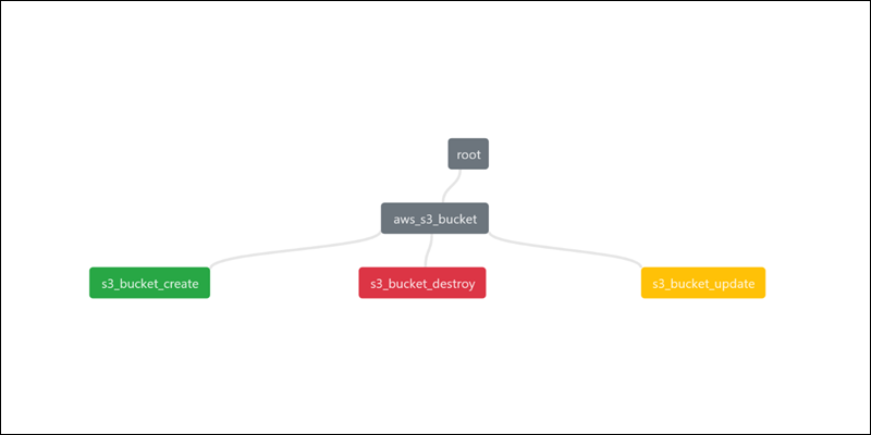
The workflow is straightforward: users generate a Terraform plan in JSON format and upload it through a web browser. The tool shows planned resources and changes in an interactive graph interface.
Terraform Visual Key Features
The main features include:
- Plan visualization. Displays changes from a Terraform plan.
- Browser-based workflow. Users generate a Terraform plan JSON and upload the file directly through a browser.
- Simple interface. The tool focuses on displaying a Terraform plan without additional configuration or infrastructure management features.
Terraform Visual Pros
Some pros include:
- No installation. The browser-based utility only requires having a Terraform plan file in JSON format.
- Easy to use. The workflow is straightforward, making Terraform Visual suitable for users who need a quick graphical representation.
- Free and open source. No paid subscription or account requirements.
Terraform Visual Cons
The major cons include:
- Plan-only visualization. Terraform Visual does not provide live infrastructure or state views like some other tools.
- Limited development. Newer Terraform plan JSON changes may not be supported immediately due to slowed development.
- Few features. Compared to other tools, it provides few resource exploration and graph options.
Terraform Visual Pricing
Terraform Visual has no paid plans. It is a free and open-source tool.
Rover
Rover is an open-source Terraform visualizer that has multiple ways to explore infrastructure in a Terraform project. It generates a resources overview, an interactive resource map, and a dependency graph.
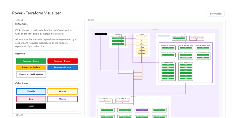
Rover generates several complementary views of the same Terraform environment. It can create standalone visualizations and SVG exports, which makes it easier to share diagrams and add them to documentation.
Rover Key Features
Rover's main features are:
- Multi-view. Rover provides a resource overview, interactive resource map, and dependency graph.
- Docker workflow. Rover runs through Docker without requiring a local installation of its dependencies.
- SVG export. The tool can export Terraform graphs as SVG images that scale without quality loss and work well in documentation.
- Standalone exports. Rover generates standalone visualizations that are shareable without keeping the Rover server running.
Rover Pros
The main pros when using Rover are:
- Multiple visualization types. Rover combines dependency graphs, resource overviews, and maps into one tool.
- Easy sharing. Standalone exports allow sharing visualizations without requiring others to run Rover.
- Open source. Rover is available without paying for a hosted visualization platform.
Rover Cons
Some of its cons include:
- A Docker or local build. Rover requires more setup and local resources than using a browser-based visualization tool.
- Terraform access. To generate a plan, Rover needs access to the resources and credentials required by Terraform.
- Density. Interactive graphs become dense as the number of resources increases. It is not suitable for large environments because graphs become difficult to navigate.
Rover Pricing
Rover is another free, open-source option for visualizing Terraform. It offers no paid hosted tiers.
Inframap
Inframap is an open-source CLI tool for generating infrastructure diagrams from Terraform state files or HCL configuration. It filters out unnecessary provider and state information to simplify graphs.
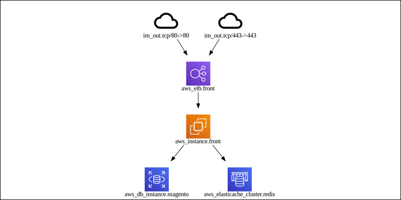
The tool helps visualize cloud infrastructure. Inframap knows common resource relationships across providers, such as AWS, Azure, OpenStack, and GCP. The tool can also prune sensitive information from Terraform state before generating diagrams, making sharing more secure.
Inframap Key Features
Inframap's main features are:
- State and HCL support. Inframap can generate diagrams from Terraform state files or configuration.
- Filtering. It removes provider metadata and other state information that can clutter Terraform dependency graphs and make them hard to read.
- Provider-aware diagrams. Inframap knows resource relationships between common providers, such as AWS, Azure, OpenStack, etc.
- State pruning. The
prunecommand removes sensitive information from a Terraform state before generating a diagram.
Inframap Pros
Its main pros include:
- Clean diagrams. Inframap removes provider and state information found in the standard terraform graph command to produce a cleaner visual.
- Free and open source. The tool does not require a subscription or a hosted service.
- Multiple providers. Includes support for several major cloud providers.
Inframap Cons
Some cons are:
- Dense diagrams. Inframap does not automatically group resources using infrastructure boundaries.
- Provider limitations. Provider-aware visualizations only work with supported providers. Less common providers result in generic graphs.
- CLI-only. Inframap does not include a hosted dashboard or interactive web interface.
Inframap Pricing
Inframap is free and open source. InfraView is a similar, separate hosted product from the same company for teams that require continuously updated infrastructure visualization.
Brainboard
Brainboard is a hosted infrastructure design platform that combines visual cloud architecture design and Terraform code generation. Instead of starting from an existing configuration, Brainboard allows users to design infrastructure visually and then generate corresponding Terraform code.
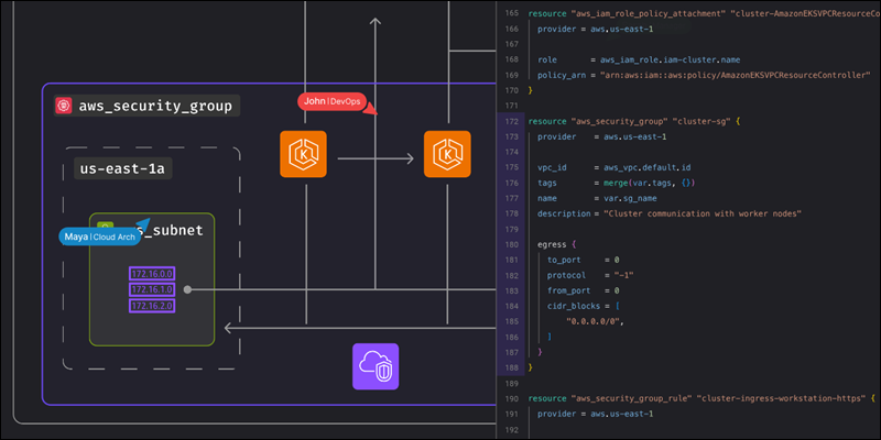
The platform supports major cloud providers and connects architecture diagrams with Terraform workflows. It includes planning, deployment, and CI/CD processes. Brainboard also has reverse-engineering capabilities for some cloud environments, turning deployed infrastructure into visual architectures and Terraform code.
Note: When you're ready to deploy that infrastructure, consider phoenixNAP's Bare Metal Cloud for dedicated, high-performance compute without the overhead of managing physical hardware yourself.
Brainboard Key Features
Key features of Brainboard are:
- Visual design canvas. It uses a drag-and-drop interface to add cloud resources to a canvas across AWS, Azure, GCP, and OCI.
- Live code generation. Generates Terraform code and stays in sync with diagram changes.
- Reverse engineering. Imports existing AWS or Azure environments and turns them into Terraform code and editable diagrams.
- Embedded CI/CD. Includes an engine to visualize the pipeline for plan and apply operations.
- Drift detection. Performs periodic scans on deployed infrastructure and flags any divergence from the design.
Brainboard Pros
Brainboard's pros are:
- Design-based workflow. Users create infrastructure visually before working with Terraform code.
- Beginner-friendly. The visual interface simplifies Terraform concepts for users unfamiliar with HCL.
- Reverse engineering. Converts existing infrastructure into diagrams, which helps document environments that lack documentation.
- Multi-featured platform. Enables architecture design, Terraform generation, and deployment workflows in one platform.
Brainboard Cons
Main cons when using Brainboard include:
- Hosted. Brainboard has no free self-hosted version for teams that require running everything on their own infrastructure.
- Restricted code editing. Editing generated Terraform code is restricted on lower pricing tiers.
- Per-user pricing. Costs increase with more users, so large teams need careful planning.
Brainboard Pricing
Brainboard offers a free plan with unlimited architectures, Terraform code generation, and public templates. The Pro plan costs $99 per user per month and adds features such as Git integration, architecture versioning, CI/CD, RBAC, unlimited deployments, and remote backends.
An Enterprise plan includes even more features, such as self-hosted runners, SSO, private module registries, reverse engineering, and editing generated Terraform code. Enterprise pricing is available on request.
Overmind
Overmind is a Terraform visualization and change-analysis platform that focused on infrastructure change impact. It analyzes a Terraform plan against live infrastructure to identify dependencies and possible risks.
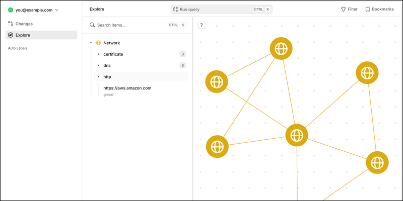
Overmind specializes in blast radius analysis and change safety, not infrastructure documentation. It combines Terraform plans with live cloud and Kubernetes data to reveal dependencies that are not fully represented in Terraform configuration or state.
Overmind Key Features
Overmind's key features are:
- Live dependency mapping. Overmind queries Kubernetes and cloud APIs to identify dependencies in live infrastructure.
- Blast radius analysis. It identifies resources that a Terraform change may affect.
- Risk analysis. Overmind finds potential risks and explains how a change can affect other resources.
- CI/CD integration. Overmind works as a Run Task in a CI/CD pipeline with HCP Terraform and Terraform Enterprise.
Overmind Pros
It's main pros are:
- Advanced analysis. Overmind provides risk and blast radius analysis in addition to displaying resources.
- Live data. It identifies infrastructure dependencies that are not represented in Terraform state.
- Change review. The tool helps teams analyze the potential impact of a Terraform change before applying it.
- Integration. Overmind fits into existing HCP Terraform and Terraform Enterprise workflows.
Overmind Cons
Some cons include:
- Cloud access. Overmind requires read access to live infrastructure, which needs additional permission changes.
- Not for documentation. Although it generates architecture diagrams, Overmind is more advanced than necessary for a documentation use case.
- Non-transparent pricing. Enterprise pricing is quote-based and requires additional communication.
Overmind Pricing
Overmind offers a free tier for small teams and individual users. Enterprise features and integrations are available through quote-based pricing.
Graphviz (+ terraform graph Command)
Terraform includes the terraform graph command in its CLI. It allows users to generate a dependency graph in DOT format. Use Graphviz to process the resulting data and create a visual diagram of Terraform resources and their relationships.
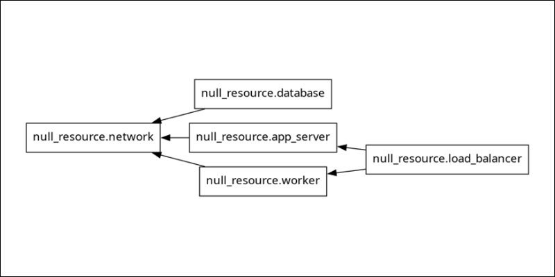
The command and Graphviz are among the simplest ways to generate a Terraform dependency diagram because they don't require a separate platform. The workflow is available locally in the CLI, which is ideal for teams that need basic, automated, offline visualization.
Graphviz Key Features
Main features of terraform graph and Graphviz are:
- Built-in. The terraform graph command is included with the Terraform CLI.
- DOT output. Terraform generates standard DOT output. Graphviz is a DOT-compatible tool.
- Configuration and plan graphs. The command generates graphs from Terraform configuration or a specific execution plan.
- Offline. The complete workflow runs locally without sending infrastructure data to a hosted service.
Graphviz Pros
Pros when using Graphviz and terraform graph are:
- Simple setup. Terraform includes the terrafom graph command by default. Graphviz installs separately (typically through the CLI).
- Free and open source. Both tools are free to use and require no subscription.
- Works offline. Infrastructure information stays private and is not exposed to a third-party service.
- Easy to automate. The command easily embeds into scripts and CI workflows.
Graphviz Cons
Cons include:
- Non-interactive. The output is a DOT file that renders into a static image rather than an interactive graph.
- Noisy. The graph includes provider and state-related nodes, which makes large graphs difficult to read.
- Manual updates. The diagram needs manual regeneration when Terraform configuration changes.
- Limited analysis. The command shows dependencies. It doesn't show additional features, such as cost analysis, drift detection, or blast radius analysis.
Graphviz Pricing
Terraform graph is included with Terraform. Graphviz is free and open source. There are no subscriptions available.
How to Choose the Right Terraform Visualizer for Your Stack
Several factors can help narrow down the choice between different Terraform visualizers. The table below summarizes the main features and differences between the tools mentioned in this guide:
| Tool | Open Source | Input | Best For |
|---|---|---|---|
| Pluralith | No | Plan | PR review with change and cost highlighting. Interactive and hosted. |
| Blast Radius | Yes | State/configuration | Free local interactive exploration. |
| Terraform Visual | Yes | Plan (JSON format) | Quick, interactive plan review in a browser. |
| Rover | Yes | Plan/configuration | Combined overview/map/graph in one run. Interactive and local. |
| Inframap | Yes | State/HCL | Clean, provider-aware, static state diagrams. |
| Brainboard | No | Visual design | Design-first teams and Terraform beginners. Interactive and hosted. |
| Overmind | No | Plan/live infrastructure | Pre-apply risk and blast radius analysis in an interactive and hosted environment. |
terraform graph + Graphviz | Yes | Plan/configuration | Zero dependency, one-off static diagrams. |
The choice depends on the team's specific focus:
- Enriched PRs. Teams that require PR-embedded diagrams with no extra sign-up should look for open-source CLI tools first. Choose Rover or Inframap for state and configuration, or Terraform Visual for plans.
- Pre-apply risks. For teams that require more than pure visualizations, choose a tool such as Overmind to analyze pre-apply risks.
- Design. Teams still learning Terraform or working with stakeholders less fluent in HCL get value from Brainboard's design-first focus.
- Compliance. Compliance-sensitive environments should favor offline tools such as Graphviz, Blast Radius, Rover, and Inframap. These run locally and are not cloud-hosted solutions.
The right tool depends on visualization needs and how often the infrastructure requires generating graphs.
Conclusion
This guide reviewed eight tools for visualizing Terraform infrastructure. The tools range from zero-dependency to hosted platforms with advanced features.
Next, learn more about Terraform data sources.